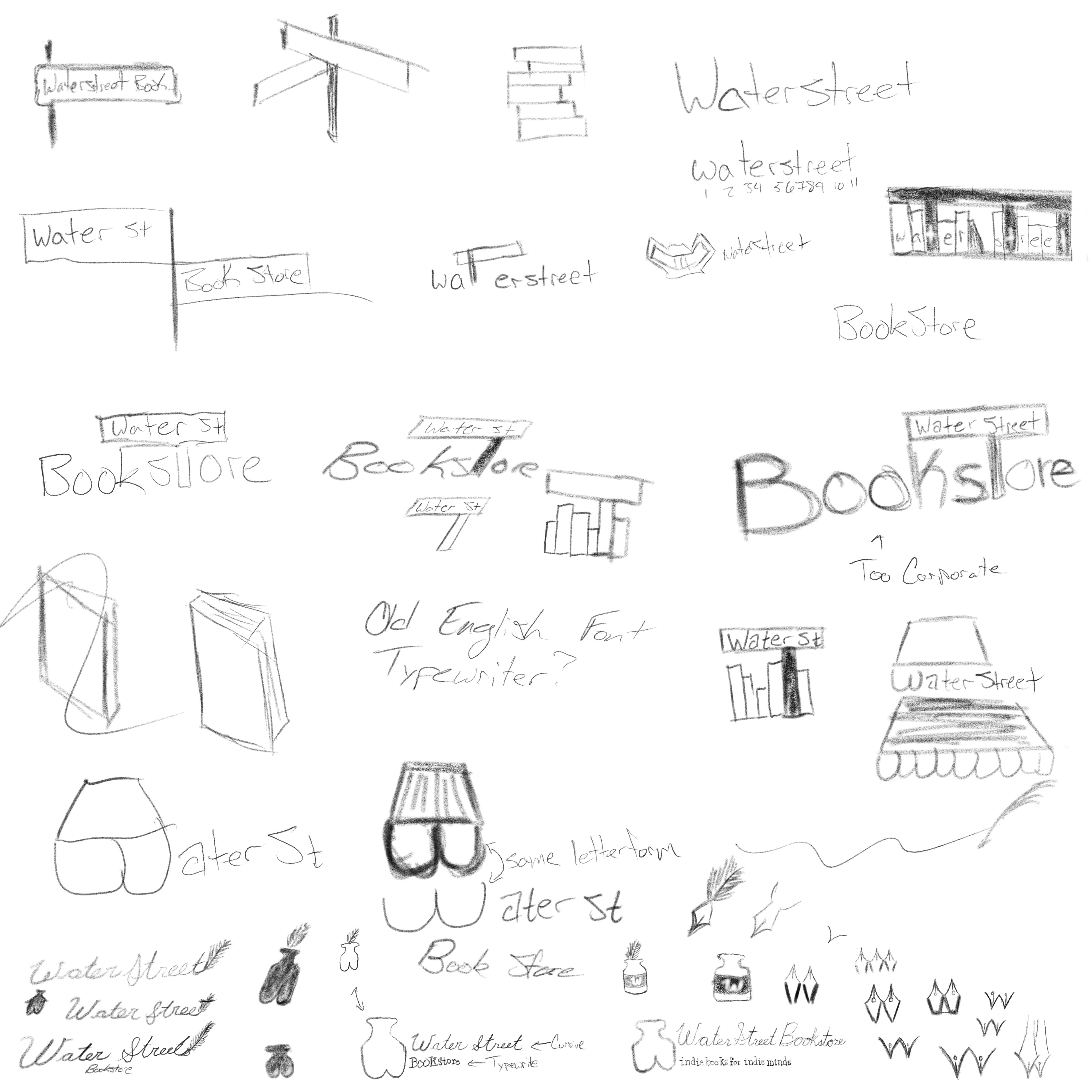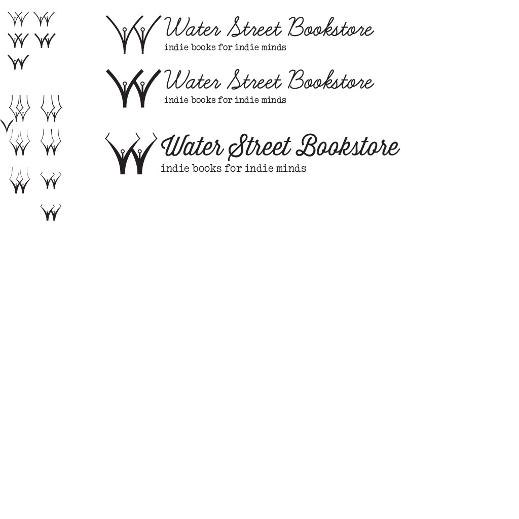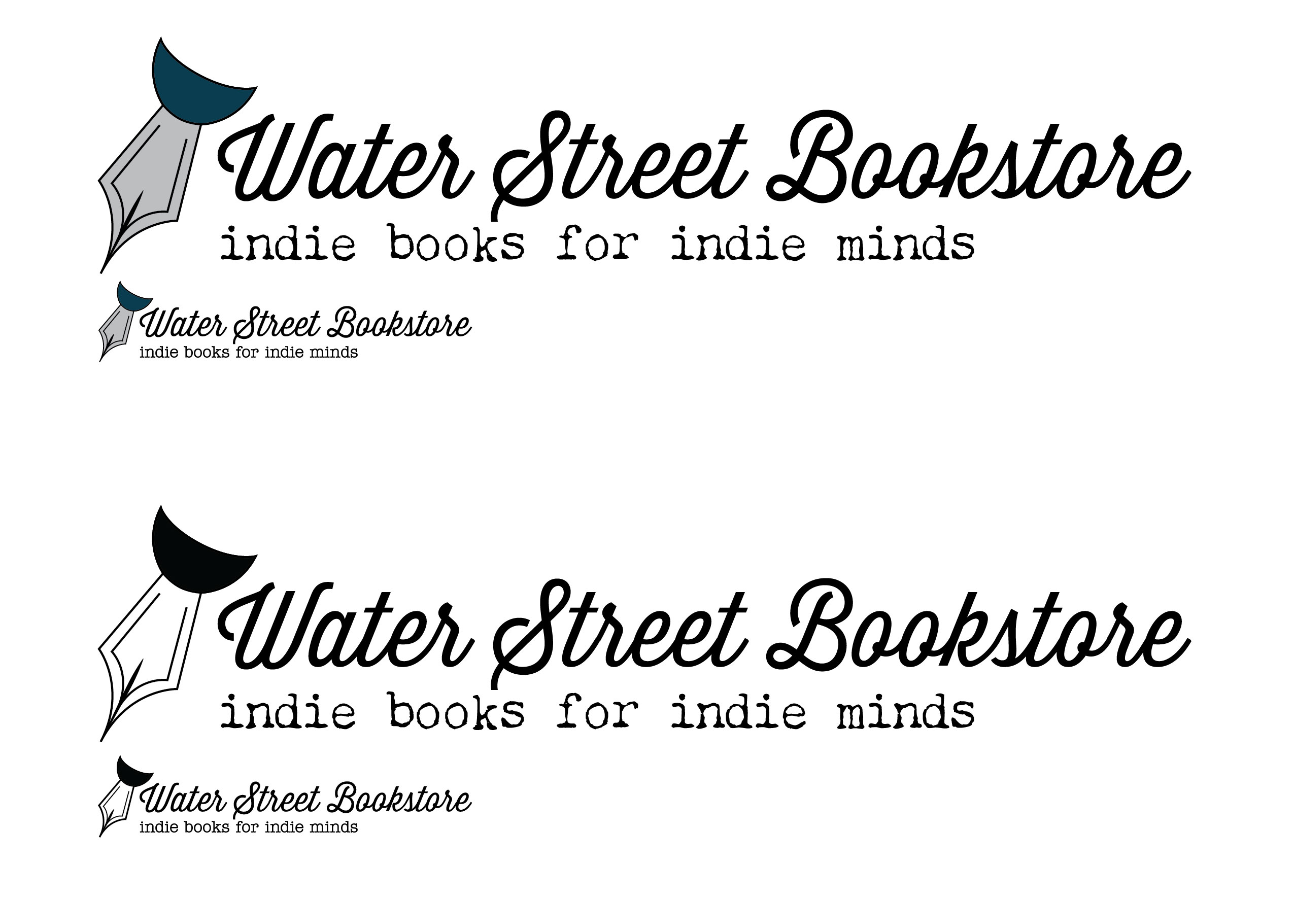


As part of a set of assignments for my New Media Design class, I was tasked with reimagining a company's logo and branding. For this, I chose to redesign the logo for a bookstore. After trying out a multitude of possible designs, I ultimately landed on a fountain pen as I felt it fit well with the brand's aesthetic and purpose. Of course, the pen took a lot of trial and error until I got it looking exactly how I imagined; I wanted it to include a nod back to the store name, so there is a hidden "W" in the markings of the fountain pen tip.
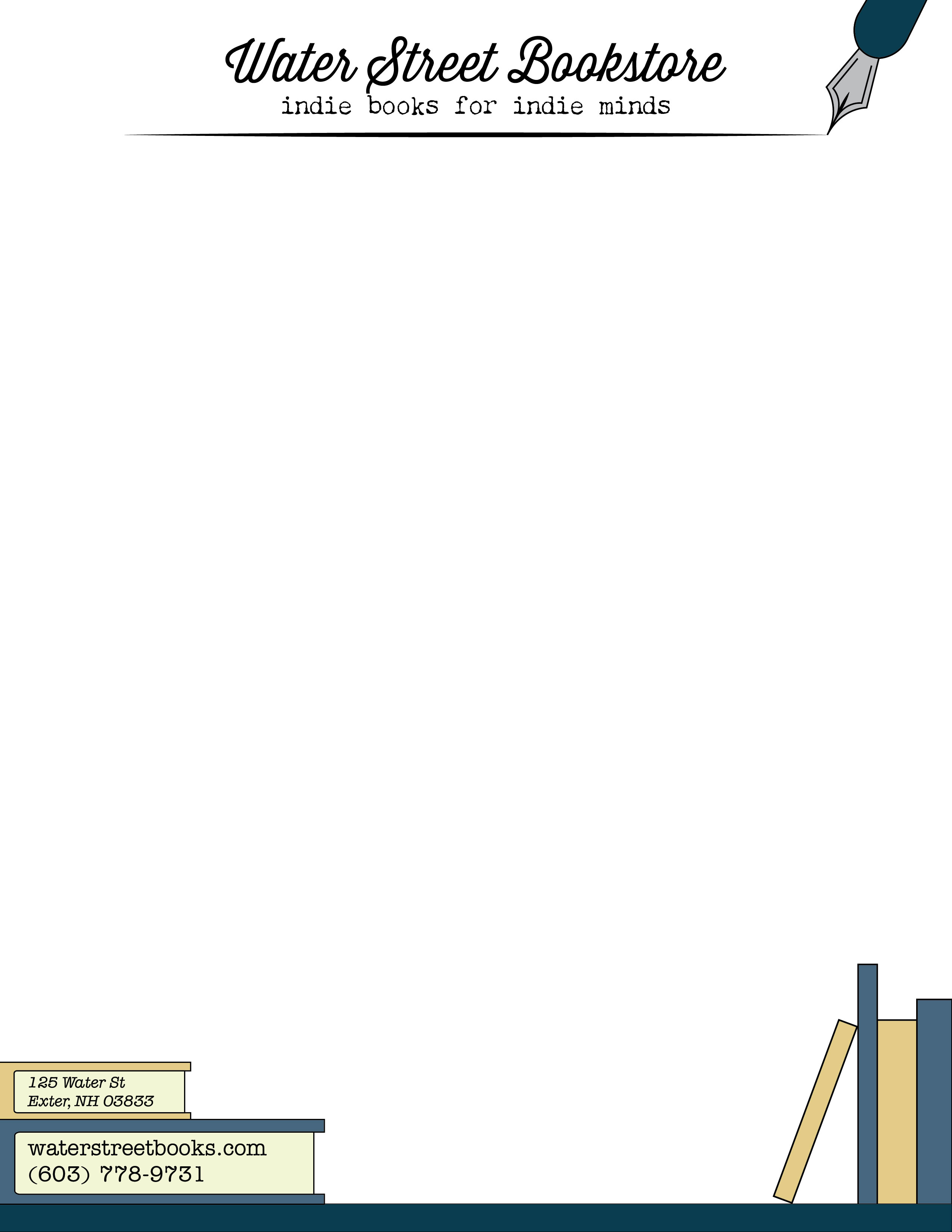
Beyond just the logo and brandmark, I was also set to design a business card, letterhead, and a piece of takeaway that one could expect to see on the desk by checkout detailing upcoming events. For all of these, I stuck with the common theme to outline the edges with books, and underlined the title of the page with a mark seemingly drawn by the pen that is the logo.
